GoTov
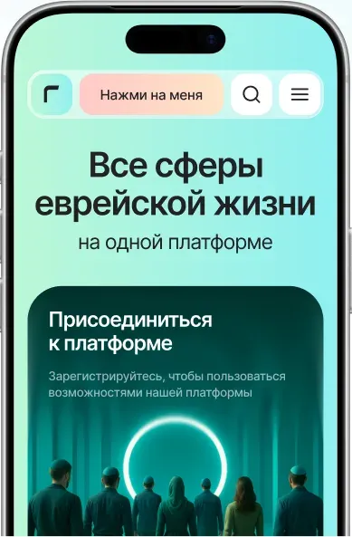
GoTov.org brings religious, cultural, and social services together on one digital platform.

When payday is still far away, but you need money now. MoneyDay is an online microloan service where you can apply through the website or mobile app. 1.5M clients · 94% approval rate · 8.8 average rating
Role
Product designersole designer on the teamScope and team
3 platforms160 screens, working with a PM and developers
02 · Scope of work
03 · Context
MoneyDay offers short-term loans with an application process that takes about 10 minutes. People want one thing: fast access to money without the hassle.
Here's what I designed, what changed, and what didn't go as planned.
04 · Problem
People wanted quick access to money. The product got in the way with a long sign-up flow, a cluttered calculator, and an empty account.
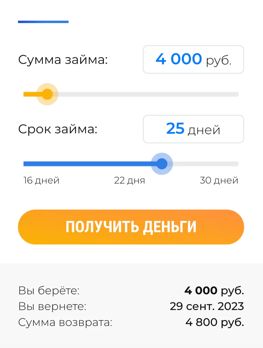
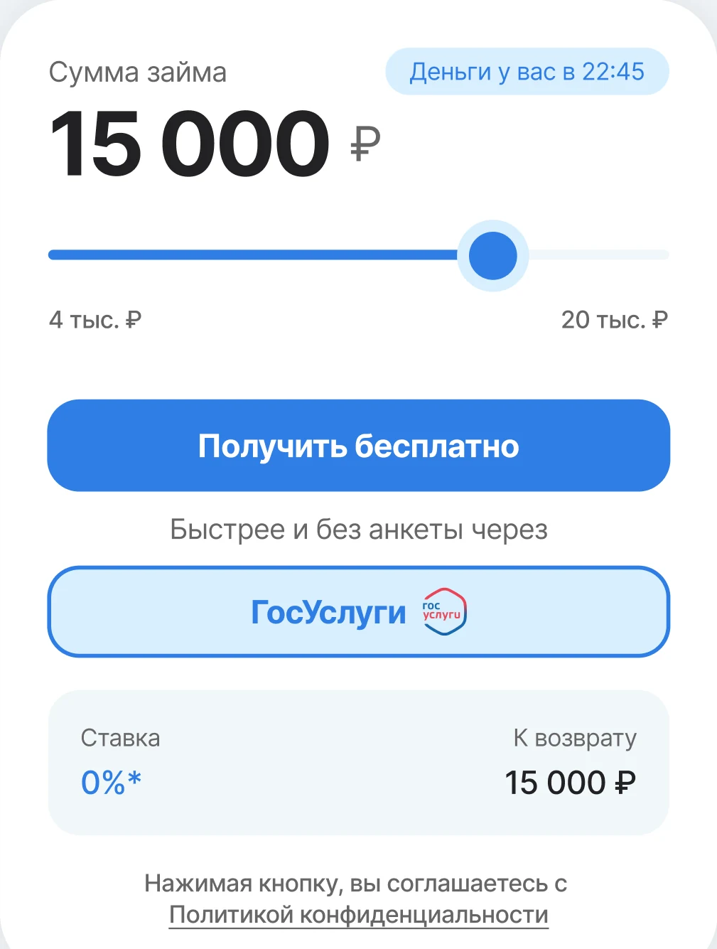
Drag the slider. The old calculator on the left is cluttered, with the total hidden below. The new one shows the amount, interest rate, and repayment upfront, plus quick sign-in via Gosuslugi.
05 · Research
I studied 15 major competitors and went through their entire loan application flows, from the first screen to receiving the money. Three problems kept coming up.
From the first screen to receiving the money. Here are the issues I found across most competitors.
Too many steps, fields, and explanations. Most competitors had the same problem, which made this an opportunity to stand out.
9of 10 require 4–5 sign-up steps
Key numbers get buried in extra details. People want to know two things: how much they'll get and how much they'll repay.
11of 15 don't show key numbers upfront
After repaying a loan, there's no reason to return. No bonuses or referral program, either in our product or competitors'.
11of 15 offer no bonuses or referrals
06 · Strategy
“When I'm short on cash before payday and have no one to borrow from, I want to get a small loan quickly and sort things out today.”
Everyone has the same ₽30,000 limit. What matters more is what happens after the loan, not its size. Users who repay with interest bring the most value to the business.
Users come from ads, referrals, and partners. They return mainly for the speed: a repeat loan takes about 15 minutes.
There was no dedicated retention feature, just push reminders.
07 · Hypothesis
Easier sign-up, clearer terms, more trust → more completed applications.
08 · Process
I built 2–3 interactive HTML prototypes for key screens to test the structure before finalizing the UI.
2–3 options → one meeting → one decision.
Hints appear right when users need them. Nothing extra gets in the way of applying.
Full flow. Swipe →
Phone → Passport → Address → SMS code → Identity verification → Done
Just the numbers needed to decide: loan amount, interest rate, and total repayment. Everything else is gone.
By clicking the button, you agree to the Privacy Policy
Drag the slider to recalculate the amount
✓One slider instead of two ✓The amount in large type ✓When the money arrives ✓Sign in with Gosuslugi ✓Rate and repayment at onceIdentity verification via Gosuslugi, with a clear benefit: a better chance of approval.
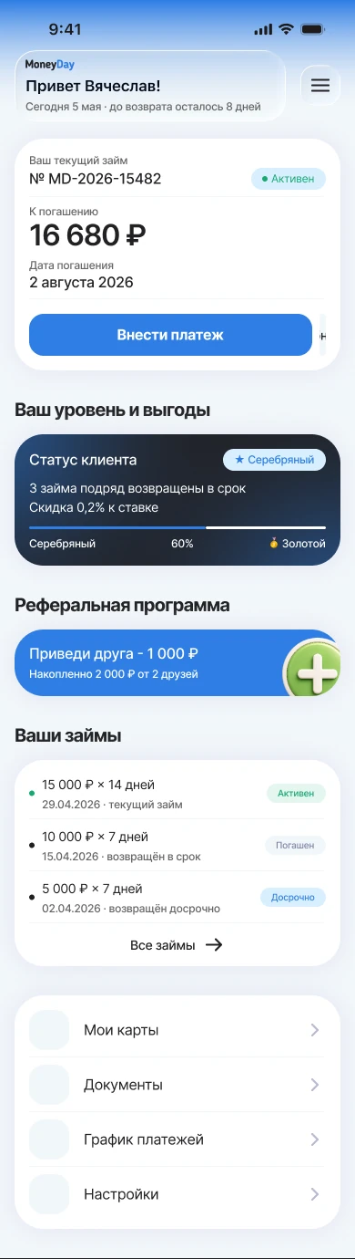
We added a referral program and asked for ratings right after sign-up, while the experience was still fresh.
We removed the bottom navigation. The flow is linear: apply → borrow → repay. No need to switch between sections, and more room for content.
10 · Design system
One library for the whole redesign: components, tokens and patterns, taken from the real interface.
21 components · 143 icons · 17 colours · 25 text styles · 8 radii
311 × 46 px · radius/lg 16 · tokens btn/bg-* and btn/text-*
Type = Text / Dropdown · states Default, Focus, Filled, Disabled, Error
Took me 7 minutes on my phone. Money came through SBP straight away.
Try another query, or pick a topic below.
Ask in chatColour and type sit in Atoms: in the original method those are atoms too, just abstract ones. Grid: 390 px with 16 px margins on mobile, 1512 with 156 on desktop. One effect style: a 32 px shadow, live on 105 instances.
Users sign up only once. Existing customers never saw the changes, while new users entered the new flow right away. There was no adjustment period: conversion jumped from 34% to 45% on day one.
Returning users were a different story. They were used to the old interface and didn't recognize the new one. Activity dropped about 8% in the first month, then recovered by month three.
1Month 1. Activity dropped. Returning users struggled with the new icons and reordered menu.
2Month 2. We eased the transition by restoring familiar icons and menu order, plus a short hint on first sign-in.
3Month 3. Activity returned to its previous level.
12 · Key learnings
A redesign needs a smooth transition. Improving the UX is only part of the job. Returning users also need a way to adjust without losing what feels familiar.
Going through 15 complete sign-up flows showed me what worked and what could be improved. Landing pages alone wouldn't reveal that.
Two or three clickable options with clear reasoning helped us make decisions faster than one polished screen.
13 · My role & team
I was the sole designer on the team. The PM handled development and priorities. I owned design, from initial interviews to pre-release design reviews.
GoTov.org brings religious, cultural, and social services together on one digital platform.
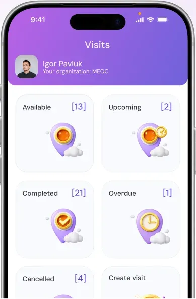
A platform that helps volunteers connect with older people and plan visits.
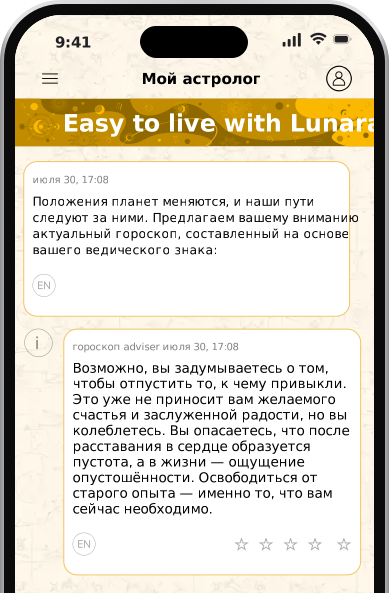
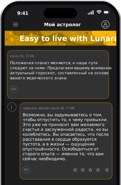
An astrology app in 30 languages: geo-segmented A/B tests, ad-matched funnels, AI-assisted decisions.
Have questions?
Open to full-time and contract work. Tell me about your product and the problem you're solving. I'll reply on Telegram, LinkedIn or by email.
This site uses Microsoft Clarity to understand how the cases are read. Privacy
Have questions?
Open to full-time and contract work. Tell me about your product and the problem you're solving.
CV, PDF