
 GoTov platform
 Kosher food
 Gotov Match
 Volunteer project





MoneyDay
MoneyDay is a mobile app for applying for short-term loans in just a few minutes.
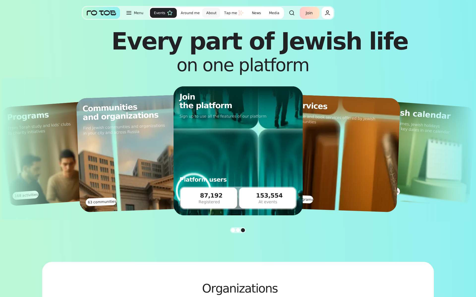
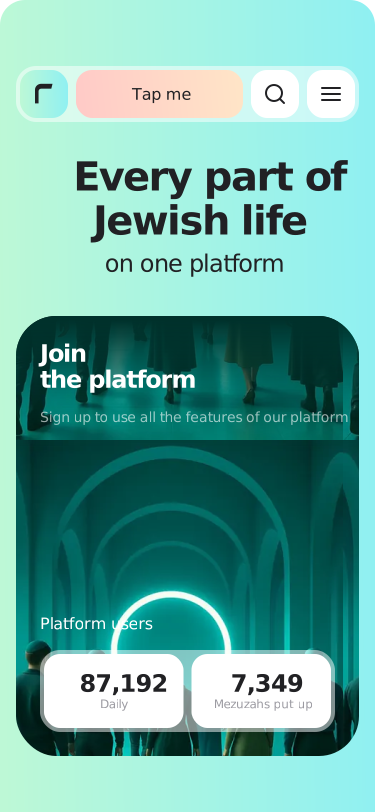
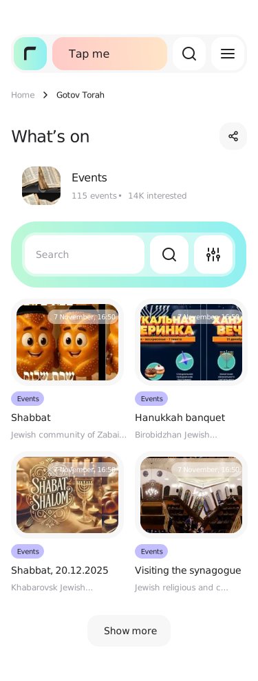
A web platform and app where Jewish community members discover events, connect with others, and stay in touch, while community leaders organize activities.
 87 1927 349
Role
Product designerlead designer on the projectTimeline and team
13 monthswith a PM and developers02 · Context
GoTov.org brings religious, cultural, and social services together. B2C users discover events and programs, while B2B admins (community leaders and rabbis) manage their organizations through a separate dashboard.
Products in the ecosystem
As the platform grew, so did my scope. Eventually, I worked across the entire product experience and related communications.
03 · My role & team
Lead designer responsible for design and design reviews. The PM assigned and managed development tasks.
What I owned
04 · Problem
Several issues were holding the platform back, affecting both new users and admins.
Registration asked for unnecessary details too early. Analytics showed this was where most users dropped off.
There was barely anything to do after signing in.
Several portal sections still had placeholder pages with no consistent visual identity.
Admins, often new to digital tools, had to go through too many steps to complete key tasks.
05 · Research
I conducted 20+ in-depth interviews with rabbis, the group facing the most friction. Many were older and struggled with registration. The interviews pinpointed where they got stuck. Analytics showed a similar issue for regular users: registration asked for information they wouldn't need until much later.
One more field and I bark.
Who uses the platform
06 · Jobs to Be Done
I want to complete a task or join an activity online in as few steps as possible and get confirmation.
I want to manage my community's members and their participation through an online dashboard.
07 · Hypothesis
registration asks only for what’s essential, secondary fields move to the personal account and every step gets a contextual hint
registration conversion will grow
people stop abandoning the form on fields they don’t need yet
08 · User journey
09 · Solution
 A short sign-upOnly essential information, with guidance at every step.See block 10 ↓
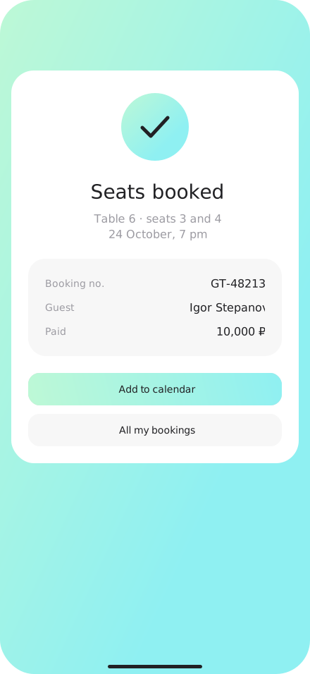
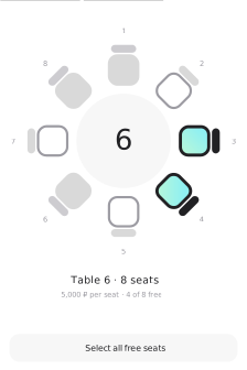 Online seat bookingSeating chart, seat or table selection, and payment in one minute.See block 11 ↓
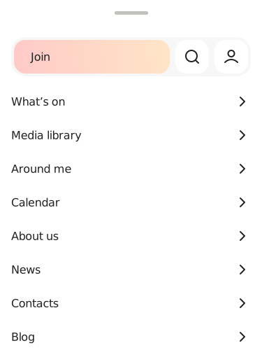
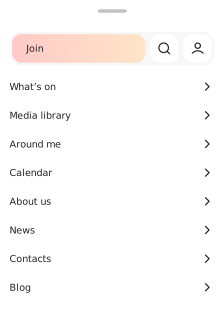 Rebuilt navigationAny section in two taps.See block 12 ↓
 Our own illustrationsReplaced every placeholder with custom AI illustrations.Example on the first screen ↑
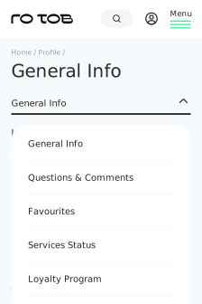 A new personal accountFamily Tree and Memorial Dates, with an option to request a prayer.
10 · Registration
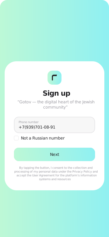
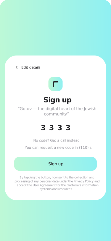
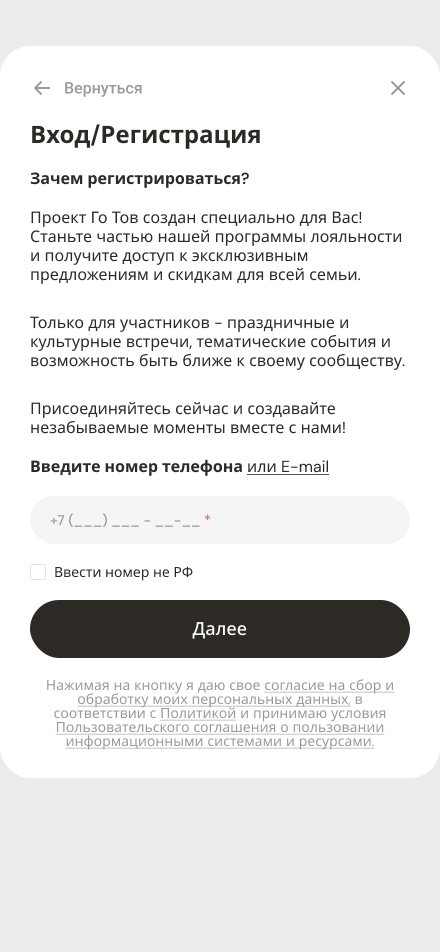
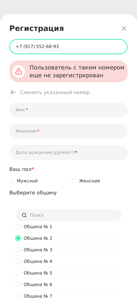
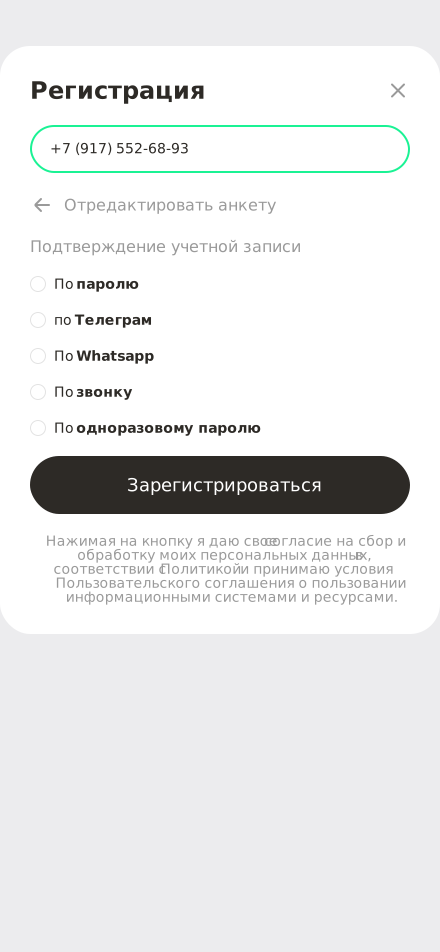
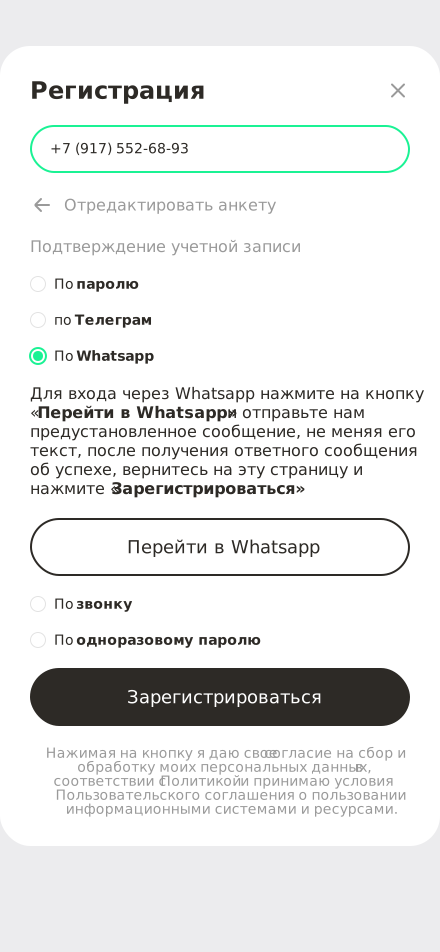
We simplified sign-up. Only essential information is required up front. Other fields moved to the account, with helpful hints at every step.
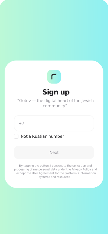
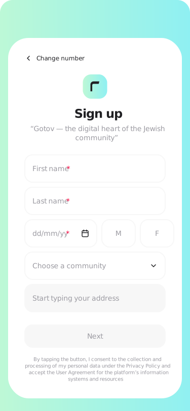
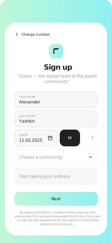
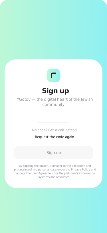
Before → after
4 screens and a messengerA long sign-in explanation, an eight-field form with a community list, five verification options, and a switch to a messaging app.
3 short stepsPhone number, short form, and verification code. The rest stays in the account. Result: ≈+15% registration conversion.
11 · Booking
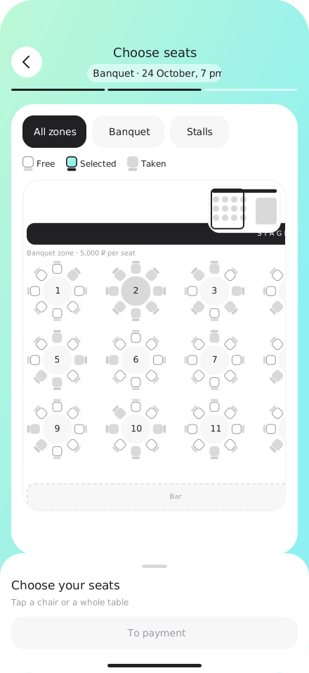
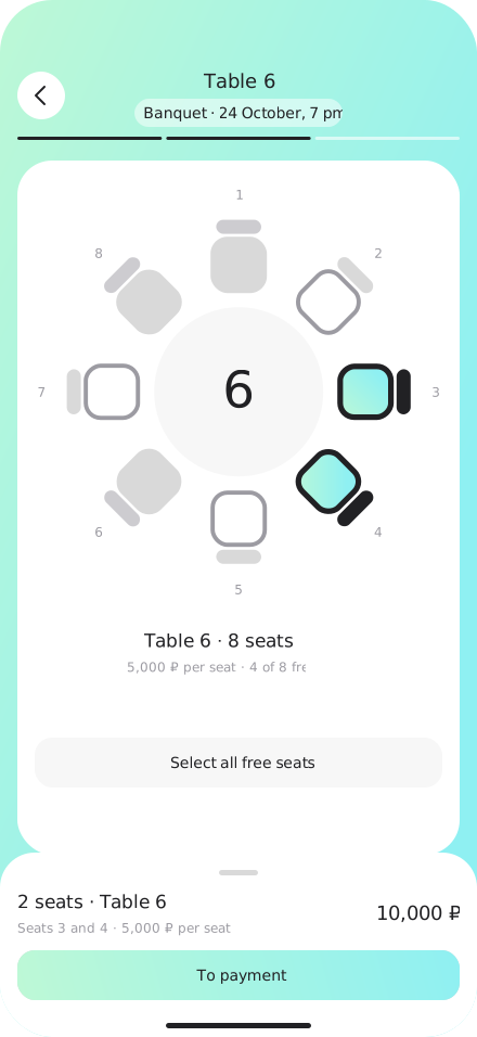
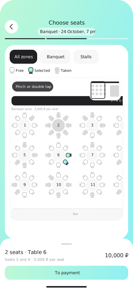
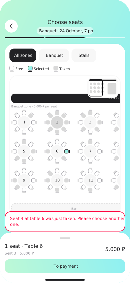
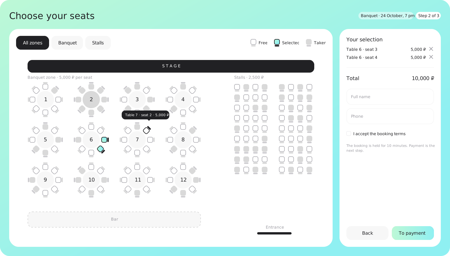
People needed an easy way to attend banquets, concerts, and community gatherings. I designed seat booking with a seating chart, zones and prices, individual seats or full tables, a total in the bottom sheet, and payment in a few taps. It works on mobile and web.
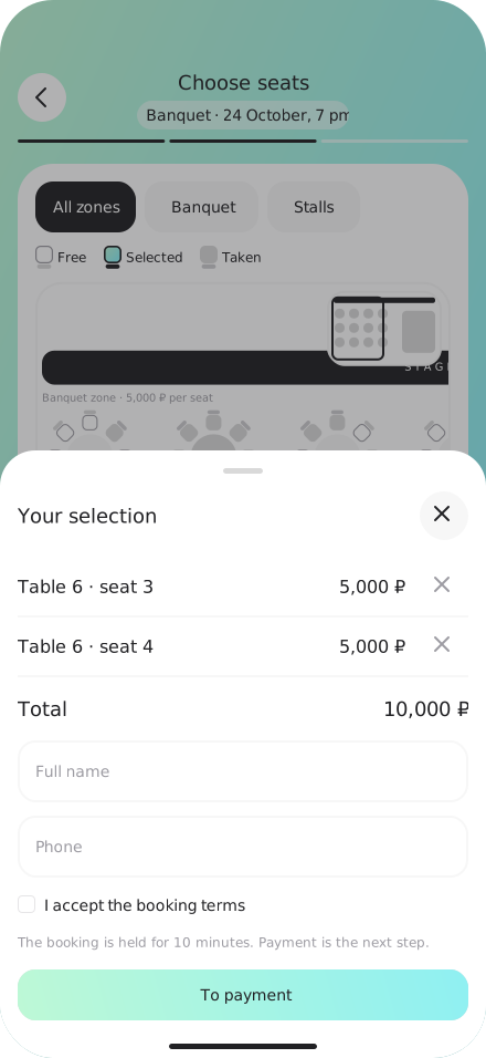
States
On the website
How this helped grow the audience
Seat booking gave people a reason to visit: an upcoming event and a chance to get a better seat. They opened the portal, signed up, and returned for the next event. Together with advertising and new features, this helped grow the audience from 40,000 to 70,000+ in a year.
See the result ↓12 · Mobile experience
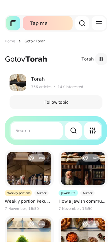
We redesigned the mobile experience with a mobile-first approach while keeping the platform's visual identity.
13 · Design system
Colors, gradients, and typography use the same Figma tokens across web, responsive layouts, and the app.
Brand colours
Gradients
Typography · DM Sans, mobile scale
From FigmaComponents in real UI states













14 · Result
Registration conversion among new users
≈+15% Estimated from community join requests in Bitrix24. No exact pre-launch baseline · 70,000+ active users. See the sign-up ↑Simpler sign-up and contextual hints improved conversion. Clearer navigation and shorter flows also reduced support requests.
Active account users: one-year growth
People came to book event tickets and services, signed up, and became active portal users.
What drove user growth
MoneyDay is a mobile app for applying for short-term loans in just a few minutes.
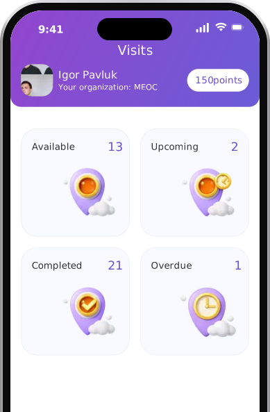
A volunteer app where three-step booking and a two-way trust system replaced manual visit coordination.
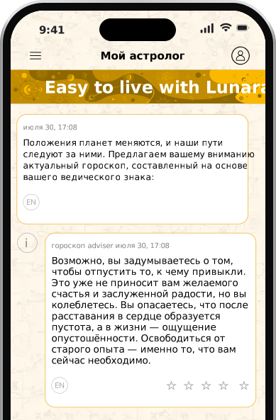
An astrology app in 30 languages: geo-segmented A/B tests, ad-matched funnels, AI-assisted decisions.