An astrology app for iOS and Android: natal chart, compatibility, horoscopes, and forecasts in 30 languages. I improved, scaled, and grew a product that was already live.
Lunara is an astrology app for iOS and Android: natal chart analysis, compatibility, horoscopes, and forecasts in 30 languages. I joined a product that already had a funnel, paywalls, and the core app, to improve, scale, and grow it.
Two main losses: time of birth (−33%) and the first screen (−27%). Other steps lose 1 to 12%.How we fixed the first screen →
March–April 2026, all languages. Two drop-off points: the first screen and the time of birth.
05 · Research
AI agents watch competitors every day
I built an autonomous system of agents on Claude AI that monitors competitor funnels, landing pages, and reviews every day. It spotted two competitor products early, Soulmate Sketch and Palm Reading, and I used that to build our own funnels in the same directions ahead of the trend.
Agents’ signalPalm ReadingOur own funnel ahead of the trend
SpottedAgents found new products at competitors while they were still one-off funnels.
DesignedI built our own funnels in the same directions.
Launched earlyWe had the products before the direction became a trend.
06 · Geo segmentation
The same A/B test, opposite results
The same A/B tests showed completely opposite results in different regions. A winner in one country lost in another, so every test is now segmented by geo before any decision.
Test: a hard paywall instead of a soft oneThe same variant runs in the USA and France at once.
100%test complete
↓Francesoft wins
↑USAhard wins
Europe: soft paywallWins in almost every country. The paywall can be closed to continue for free.
USA: hard paywallThe hard one wins: you can’t go further without buying.
Based on Lunara’s A/B tests; exact numbers are under NDA. That’s why the paywall variant is chosen per country, not one for everyone.
Visitors who came from an ad see a unique first screen of the funnel, built around the exact topic of the ad they clicked. The promise in the ad and the first thing they see match.
Ad topic, the ?topic= parameter
Before: screenshots of the live funnel with raster photos. After: the same 9 topics and copy, with vector illustrations. The rest of the funnel is shared.
…/start?topic=compatability
9:41
Lunara
Check Your Compatibility
Take a 2-minute quiz to reveal your strongest connection points, your friction zones, and how to bring you closer
When Will You Meet True Love?
Take a 2-minute quiz to see your love timeline, key windows for meeting “the one,” and what helps it happen sooner
Will Your Ex Come Back?
Take a 2-minute quiz to see if reconnection is likely, what’s blocking it, and the best next move for you
How Many Children Are in Your Path?
Take a 2-minute quiz to explore your family potential, timing themes, and the energy around parenting for you
Unlock Your Career & Money Path
Take a 2-minute quiz to spot your next opportunity, your best lane for growth, and what to focus on now
Find Your Life Purpose
Take a 2-minute quiz to uncover what you’re here to build, the gifts you’re meant to use, and what’s next
See Your Soulmate Sketch
Take a 2-minute quiz to personalize your sketch request and reveal the person you’re meant to meet
Your Stars Have a Message
Take a 2-minute quiz to find the area of life where you need guidance most right now
Your Birth Chart Holds Clues
Take a 2-minute quiz to see what your birth details may reveal about love, purpose, career, or your future
2.4 million peoplehave already found their person by the stars
Check Compatibility →See My Love Timeline →Get My Answer →Reveal My Family Path →See My Next Move →Reveal My Purpose →Get My Sketch →Reveal My Path →Find My Answer →
On Android people buy 1.9 times less often than on iOS, and many of them have old phones. So I made the funnel lighter in two ways: vector illustrations instead of raster, and CSS animations instead of JS.
×1,9fewer purchases on Android than on iOS. That is why every extra kilobyte and animation frame on a weak phone costs money.
September–October 2026, purchase conversion by platform.
The vector is 99% lighter than the original raster and half the weight of even a well-compressed WebP. It is also sharp on any screen and can be animated with the same CSS.
Total weight of the 9 illustrations from Figma. WebP: sized for a 2x screen. SVG: gzip-compressed, as the server delivers it.
CSS: transform and opacityThe animation runs on the GPU and the main thread stays free. Smooth even on old Android phones.
Heavy JS animationLoads the phone CPU: lag and freezes, and people drop out of the funnel.
10 · Key features
Features as answers to real questions
9:41
‹Lunara
The Guru has started preparing your natal chart!
In the next few weeks, the planetary transits may offer new opportunities.
Let’s make the most of it!
Continue
‹Lunara
The Stars Indicate A Strong Love Connection
A future where trust is a given, joy is an everyday delight, and new beginnings feel warm and cozy. Let’s finalize your analysis!
Continue
‹ BackLove and marriageClose
Feel free to ask about anything. If you pick one of these questions, you can edit it to fit your situation.
Looking for love⌄
When will I meet the true love of my life?
Will I have a new relationship soon?
What will my love life be like this year?
Why am I single?
Is someone secretly in love with me, or interested in me right now?
Do I already know my future partner?
‹Lunara
The Stars May Have Already Revealed Your Soulmate
Continue
‹Lunara
Rebuild the relationship or move on? Our astrologers will reveal the future of your relationship
Continue
‹Lunara
Your Compatibility Result Is Almost Ready
Enter your email to save your progress and keep your answers ready for your astrologer
Your e-mail address
Continue
1 / 6Natal chart
A low-effort onboarding asks only for birth data. Results come as simple personal insights rather than complex charts.
2 / 6Compatibility
Answers “are we a match?” in plain language instead of heavy astrology terms. The main reason people install the app.
3 / 6Horoscopes and forecasts
Built around topics: love, career, personal growth. Content feels personal, not generic.
4 / 6Future partner portrait
An emotional wow moment with a visual result people want to open and share.
5 / 6Ex and getting back together
A dedicated flow for one of the most common questions: “can we get back together?”
6 / 6Sales funnel
From curiosity to purchase: intro, data, first insight, deeper hooks, then the full report offer.
Screens from Figma: the web funnel (natal chart, compatibility, portrait, ex, email before the paywall) and the app (questions on “Love and marriage”).
11 · UX decisions
Value first, paywall second
Question-first navigationFeatures are framed as answers, not as “astrology sections”.
In the app the entry points read “When will I meet love?”, not “Synastry”.
What is your question about?When will I meet love?What about my career?Are we compatible?
Progressive disclosureQuick results first, deeper insights later, for trust and conversion.
A short insight comes first; the full report opens only if the person wants more.
Your insightMore ↓
Low-effort onboardingMinimum effort at the start and fast delivery of value.
Only three fields about birth; everything else is asked later, when it is needed.
About youDatePlaceTime
Emotional peaksThe future partner and ex flows create strong moments of engagement.
The partner portrait and the “ex” flow are the two screens people share most.
Partner portrait
Value-aligned paywallThe paywall appears after personalisation has been shown.
By the paywall the person has received three things and given only birth data.
Full reportOpen
Consistent messagingPromises in the App Store match the experience inside the app.
The store screenshots are real screens, so the first session matches the promise.
App Store✓ same as inside
12 · Design system
Three systems: the app, the web funnel, and the web portal
The product has three design systems: one for the app (Pro and Lite), one for the mobile web funnel (General One), and one for the web portal. The web portal system is under NDA, so the first two are shown here.
Web portalNDA
Pro (gold) and Lite (blue), each in light and dark. One set of 63 semantic tokens covers all four themes: the theme changes the colours, while components, spacing, and radii stay the same.
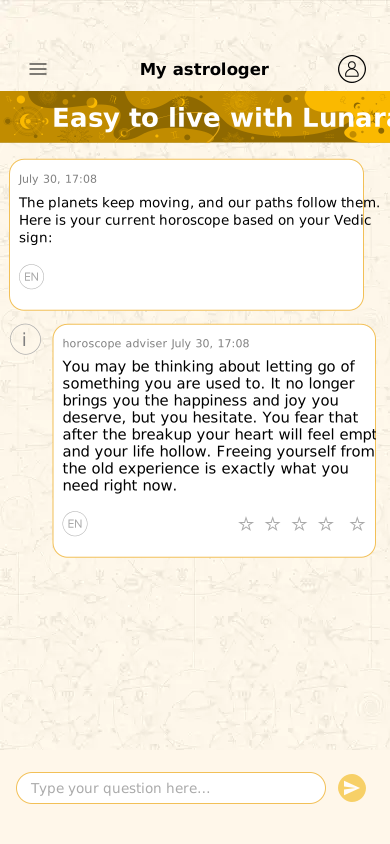
astrologer · 17:08The Moon is in your sign today: a good day to start an important conversation.☆ ☆ ☆ ☆ ☆
WomanMan
LoveCareerHealth
Get my forecast
Type your question here…➤
Chat backgroundsurface/chat
Accentsurface/accent
Bubble borderborder/bubble
Pillsurface/pill
Accent texttext/accent-aa
CTA gradientcta/gradient
Planets: one colour each, in every theme
SunMoonMarsMercuryJupiterVenusSaturnRahuKetu
Radius
1215100
Spacing
48162432
Touch target
48
General One is the system behind the mobile web funnel. It is built on atomic design: foundations, atoms, molecules, organisms. 45 semantic colour tokens and 15 number tokens. Every state is specified, down to the 97% press scale.